Sunday, January 29, 2006
Friday, January 27, 2006
Art Journal ...
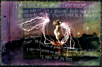
 Back end sheet:
“I would rather be ashes than dust! I would rather that my spark should burn out in a brilliant blaze than it should be stifled by dry-rot. I would rather be a superb meteor, every atom of me in magnificent glow, than a sleepy and permanent planet. The function of man is to live, not to exist. I shall not waste my days trying to prolong them. I shall use my time.” ~ Jack London
Thursday, January 26, 2006
Saturday, January 21, 2006
Art Stamp

I finally had a rubber stamp made. It's 2.5 x 2.5", just right for ATC's. I had it made through Staples. I submitted the artwork on a CD and it only took one week. They sent it out to be done. The only drawback: I didn't know it was a self-inking stamp.
That means I'm stuck with the black ink it came with - oh well.
Tuesday, January 17, 2006
Monday, January 16, 2006
Altered Books and Such ...
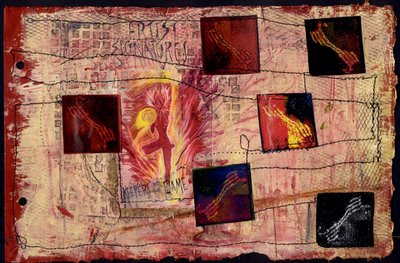
 Last August, I started an altered book, my first. I was new to ATC's, new to collage, but enthralled by the altered book concept. I chose a record album to alter because it had a cool, worn, red cover, and it came apart with screws. The book is themed "inspiration" and will be filled with all the places I get my inspiration: travel, dreams, art ... this is the cover. I put it aside and now I've taken it back out to assess. I think I need to remove the "unbelievable feats" tag, and perhaps work on the lettering in the title. I do like the painted extension of the image, though.
Altered Books and such ...
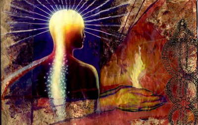
This is a two page spread from the album. I wanted to express how inspired I get while traveleing. The small painting at the left is a copy of a landscape I painted while on Martha's Vineyard last summer. The hand at the right projects out from the book's pages.
Tuesday, January 03, 2006

I haven't done much work with rubber stamps. I usually just add them at the end if I feel a piece needs more. But I bought a sheet of stamps from the Zettiology people and I thought this one was great. It was fun to color it in with various paints and colored pencils. I felt like I did when I was a kid and I got a new coloring book, LOL.
I always have a dilemna when I try to add text to a piece .... print it out? transparency? handwritten? alphabet stamps? I tried something different this time. I typed out the alphabet over and over with different fonts and printed out a couple of sheets. Then I used hole punches to clip the letters out. Time consuming, but fun.
Monday, January 02, 2006
Digital Collage

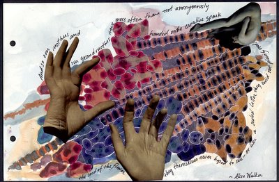
A member of our group, Paper Traders, created a rich, evocative collage using Photoshop. She so inspired me (thanks, Cynthia!) that I decided to try my hand. This is my first effort to create a traditional "collage" digitally. I tried to create the look of pasted paper and photos. It's really quite wonderful, having an infinite amount of images, patterns, photos, and "stamps" to use. I could get spoiled!
Subscribe to:
Comments (Atom)


