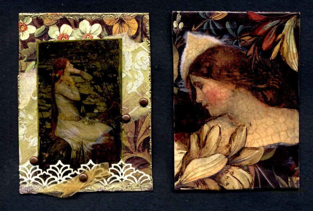
What makes a card "good" or "bad"? I mean here I have two similar cards, same elements: Waterhouse images printed onto transparencies, English chintz papers from the Victoria & Albert Museum, dabs of Brass Lumiere paint, and bits of other papers. The one on the left is horrid, or at least nothing to be proud of. The one on the right is gads better. Why? I need to analyze this if I'm to improve my artwork. Let's see, the one on the left has rigid straight lines. That's probably not a bad thing unto itself, but it seems to be fighting the soft curved lined of the chintz and woman's dress. The one on the left also has a clear separation between figure and background. Almost like she's 'caged'. I've even exaggerated that line with a gold metallic paint pen. So what are some positives about the one on the right? I like the diagonal of the woman's bent head and neck. Diagonals are dynamic. I think I like the size of the figure too, the other seems too small for the card. The flowers are a nice touch too. They add "flow" to the compostition.
The funny thing is that the card on the left took me quite a bit longer to create. And it has more stuff on it.
So today's lesson: More is not always better. Good art doesn't always take longer. Unify all elements. Scale matters (not size, lol). Look for the flow.
1 comment:
I dont have any background in art, but I am a photography so I have a good eye. And its just what I like. WHen I saw your blog..first tought I love card 2 the one one the right. You can see more of the ladys face the colors are more real...and her skin looks old like it could be an old painting. The flowers in the back gorund are bold. not to busy...very soft...her soft pink checks. The one on the left I hate.. I dont like the bottom with the lacy..it looks cheap...and the back ground stuff dont match the real picture. the pic. is ok..a girl fixing her hair...very busy pic.and stationary...I HOPE THIS HELP a little about what i think
Post a Comment